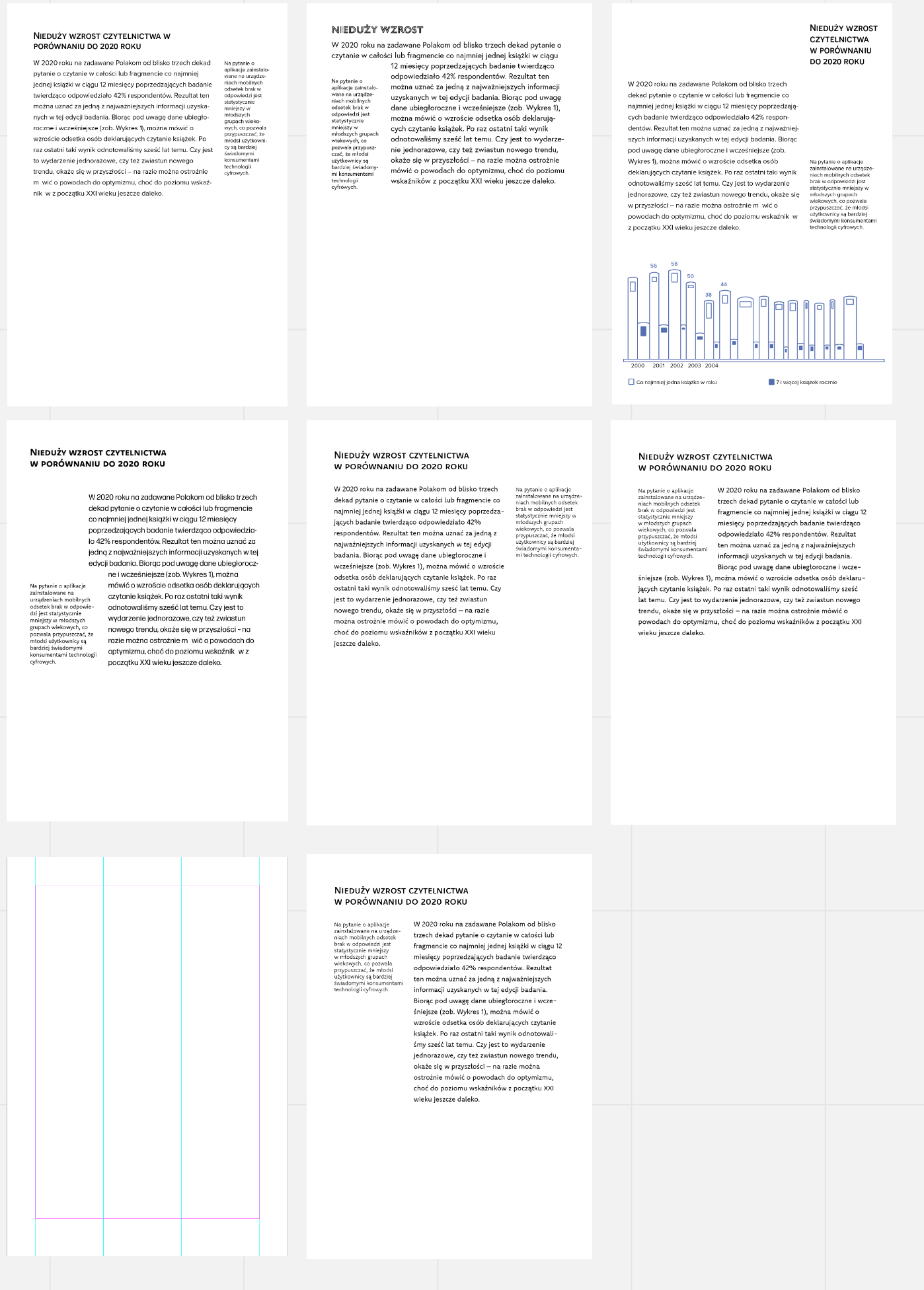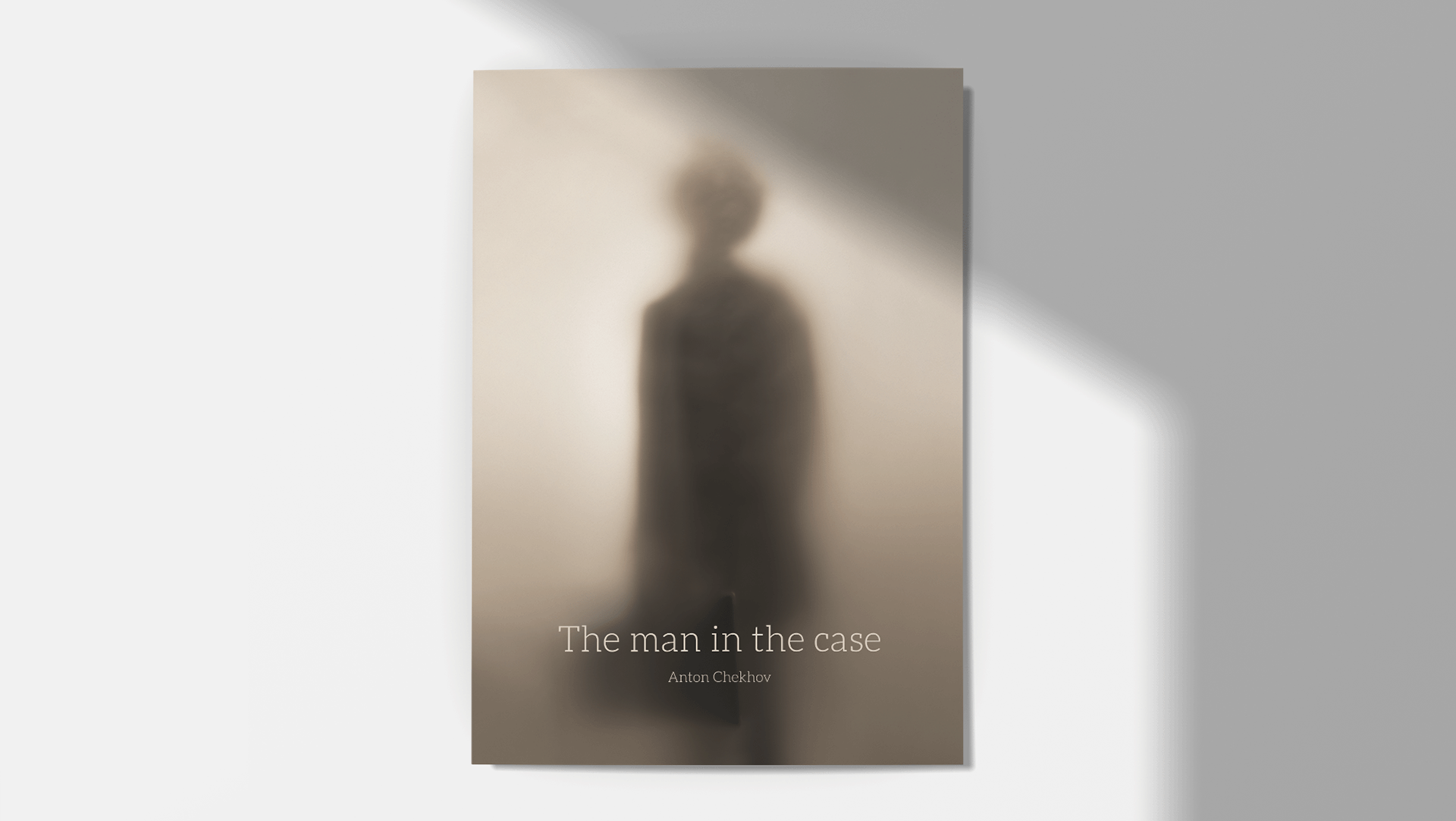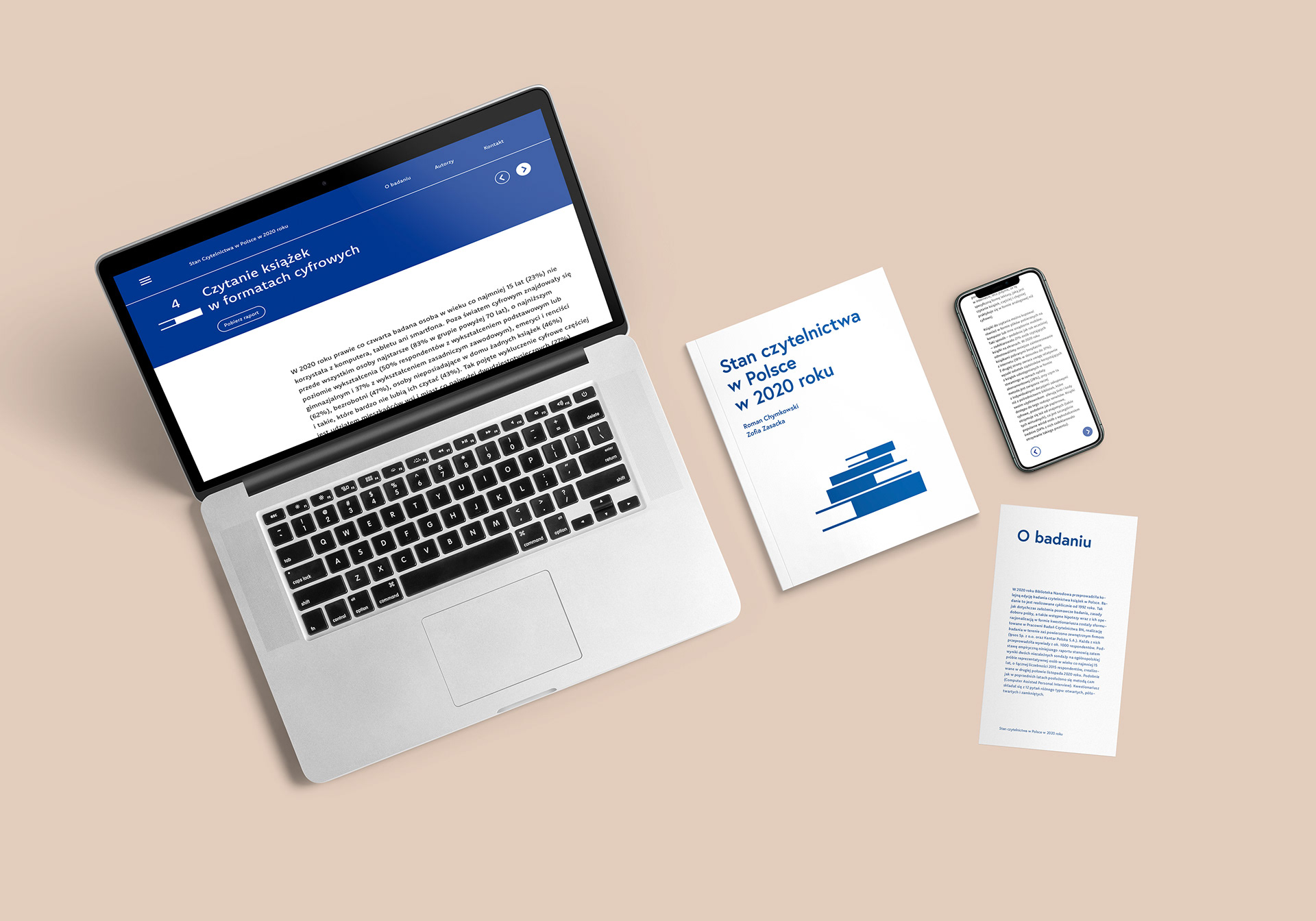
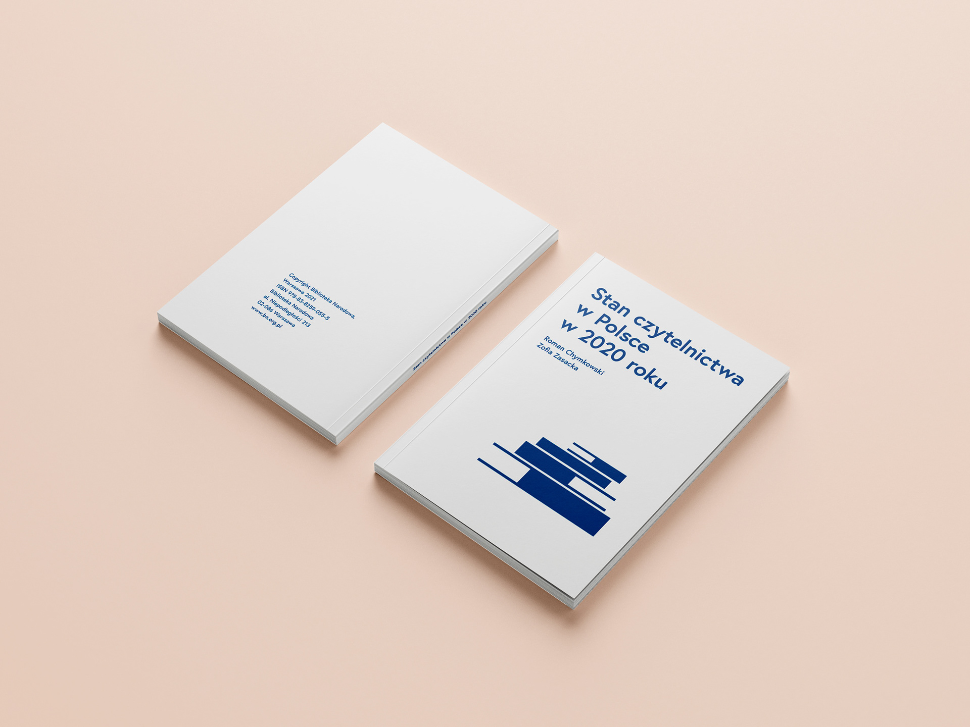
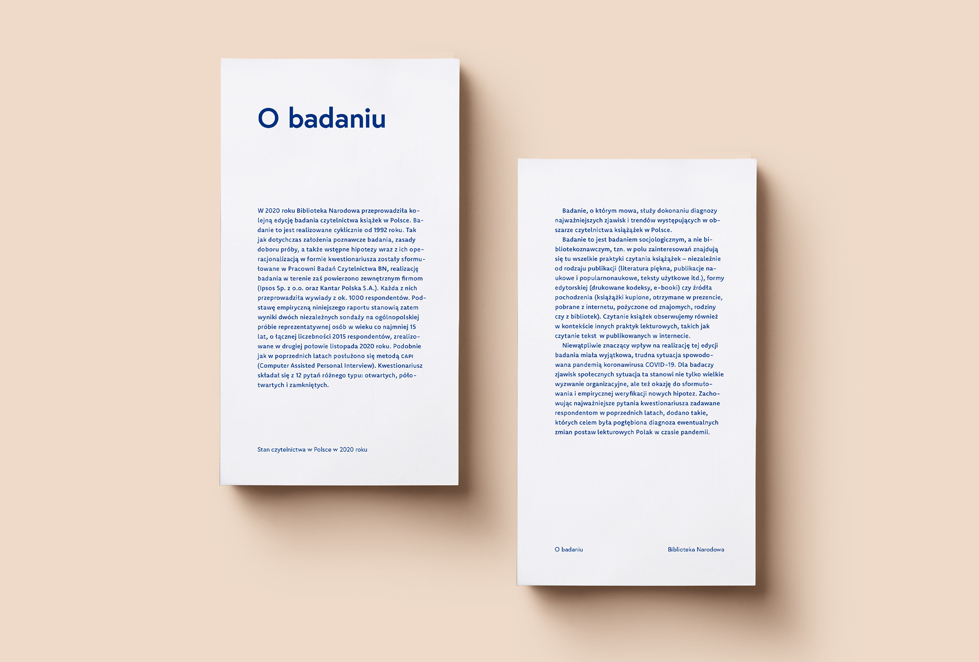
Redesign of the report on the state of readership in Poland included: overall design of the book (layout, infographics, cover) and design of the web and mobile versions.
Project constraints:
• accessibility of the publication,
• content printed in black and white,
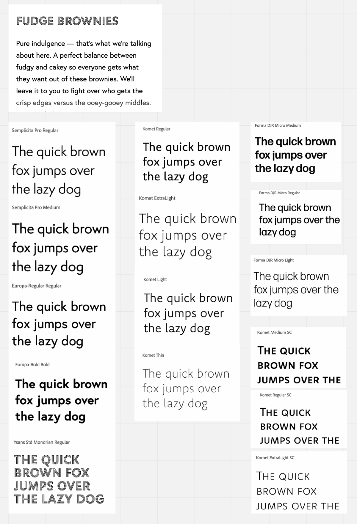
• using max. two fonts,
• achieving similar typography character for printed and digital version,
• educational visual character.
• accessibility of the publication,
• content printed in black and white,
• using max. two fonts,
• achieving similar typography character for printed and digital version,
• educational visual character.
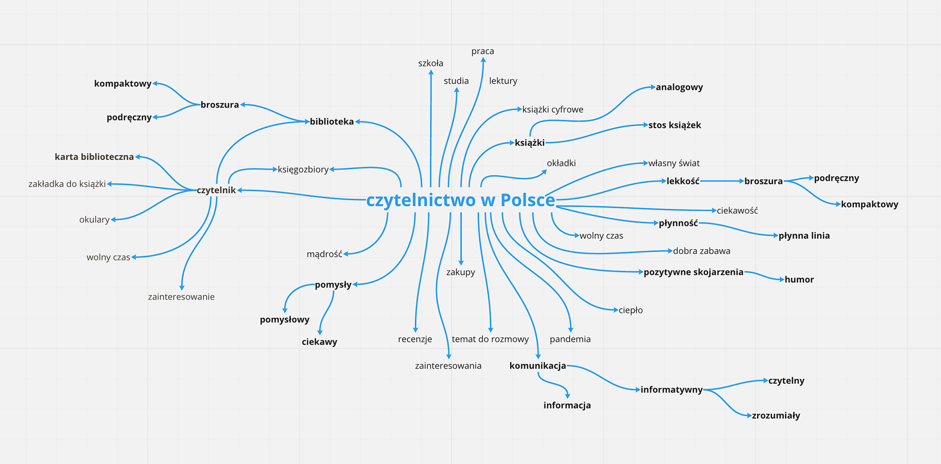
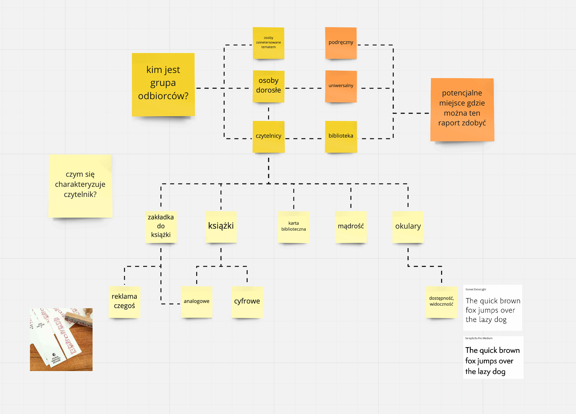
Methods:
• moodboard,
• mind map,
• legibility tests.
• moodboard,
• mind map,
• legibility tests.
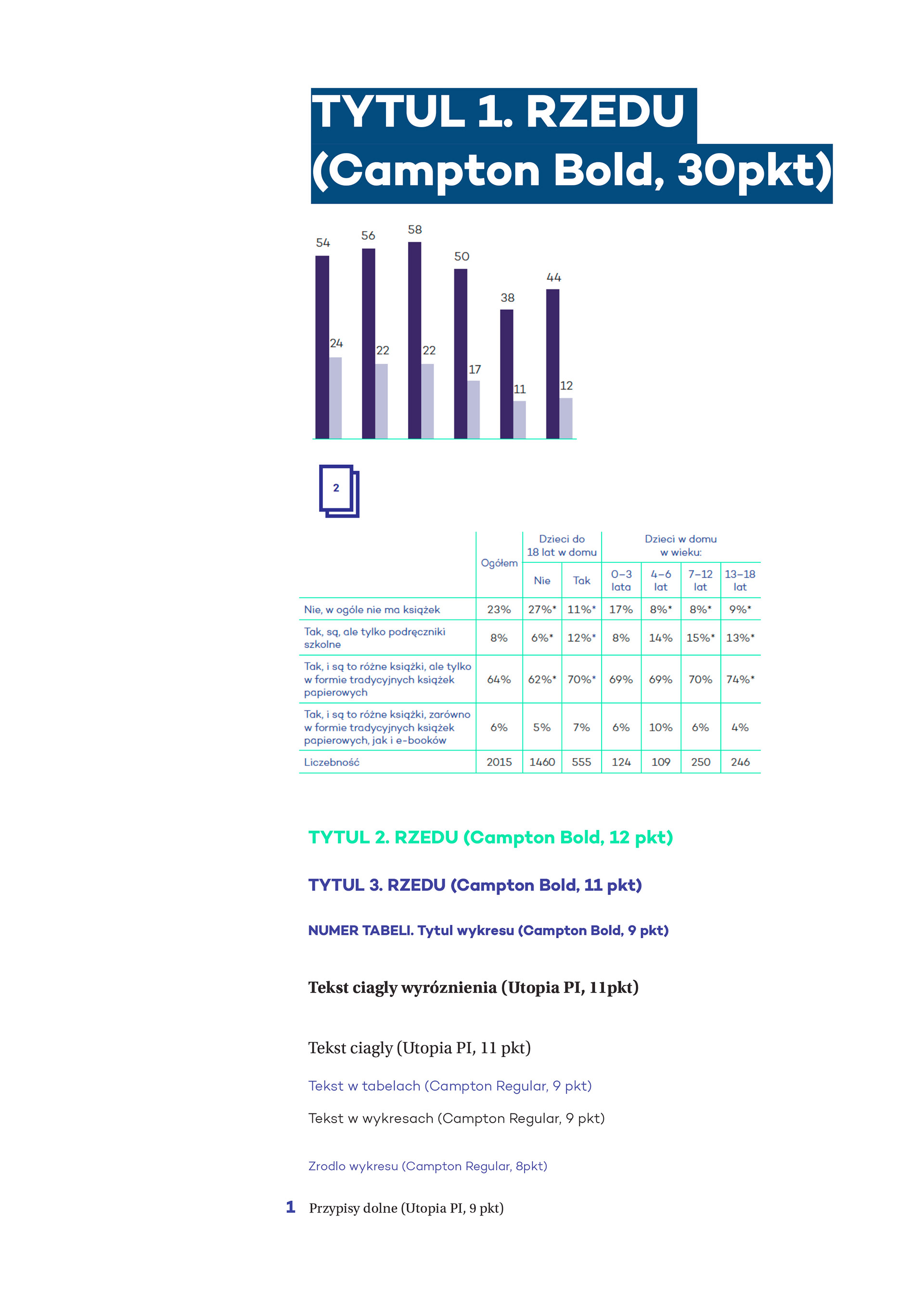
format: 148x210 mm,
paper: Olin 120g,
print: 4+4,
Gluing, sewing with thread,
Cover paper: Blue Pastel Card 300g
Items printed: 3 pcs.
paper: Olin 120g,
print: 4+4,
Gluing, sewing with thread,
Cover paper: Blue Pastel Card 300g
Items printed: 3 pcs.
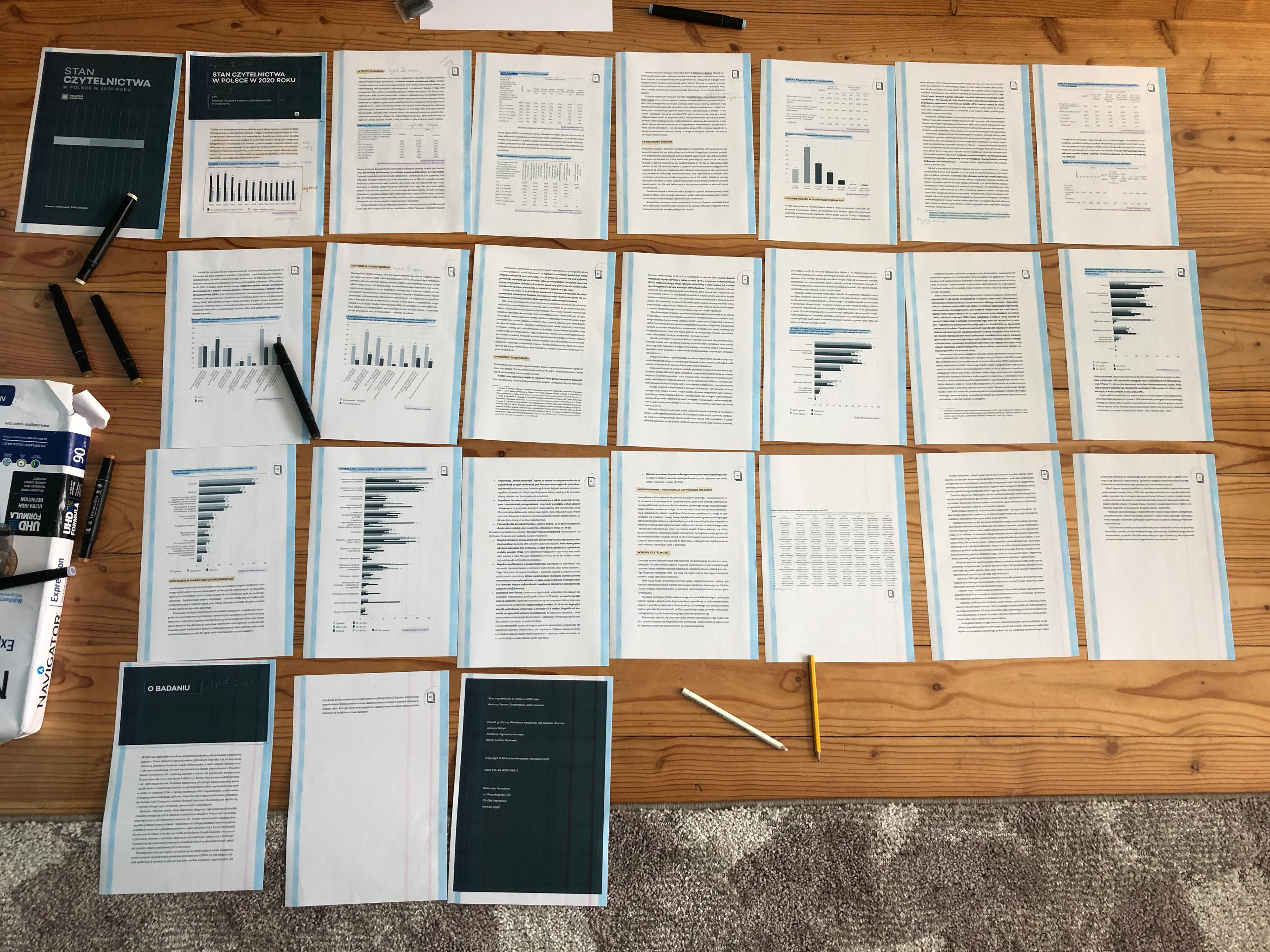
Design process
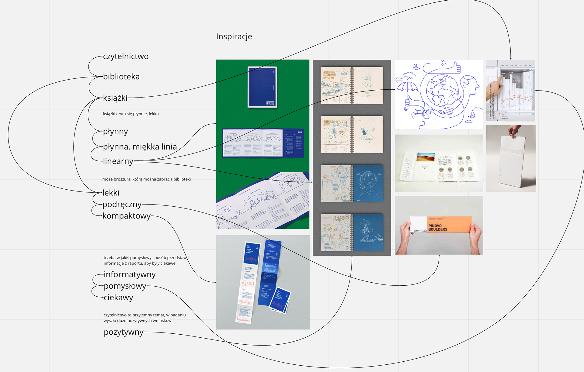
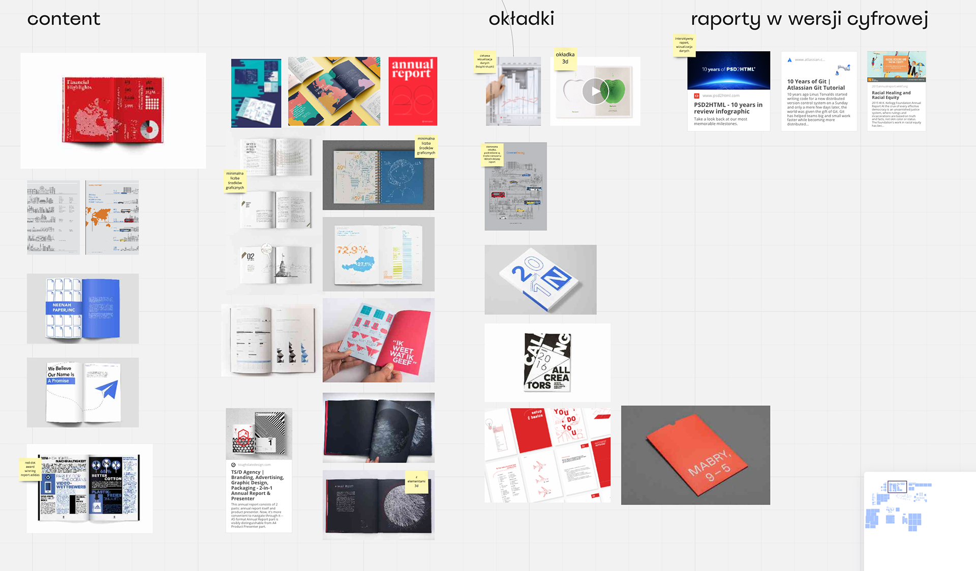
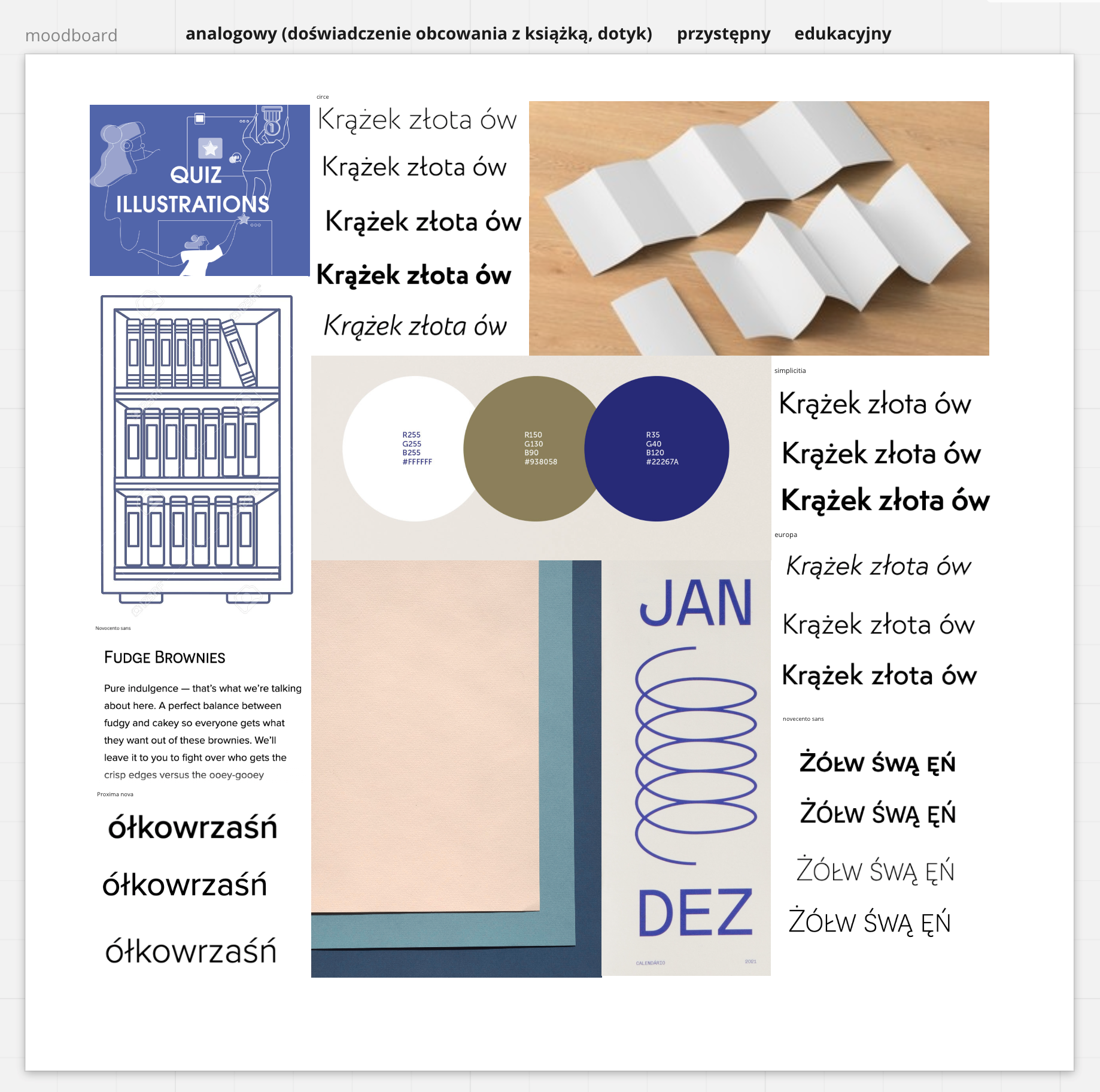
First, I analyzed the readability hierarchy of the current version of the report, detailing the typefaces used for various elements of the publication. Then I identified the audience and their values, which I then reflected in the design: analog character, accessible, educational. Based on this, I made a moodboard, selected a typeface with accessible characteristics and made the first tests and print legibility tests.