The project was completed as part of an internship at the Prime Minister’s Office in 2022.
UX DESIGN | UI DESIGN | USABILITY TESTS | FIGMA
Context
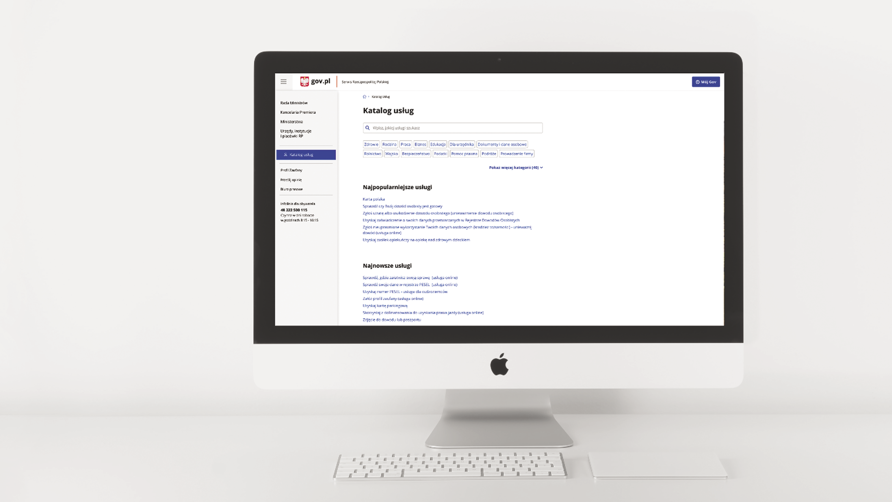
Due to the huge number of services for citizens on gov.pl it is very tough for users to find the service they need. Currently, the system offers global navigation, and users, unable to find their service, mainly use the search bar by typing keywords that do not always correspond to the service labels. This way of searching takes a lot of time to find the needed item.
The project was to create new version of service catalog for gov.pl, that allows finding the proper service quicker and seamlessly.
Scope and phases
The project was assigned to me as a part of my summer job duties. I did it independently, from planning the work to designing the prototype.

Process
Kick off:
First I analyzed the current service catalog to understand its complex structure. I created a scenario for finding several (popular and rare) services at gov.pl and asked 5 different users to complete these tasks, finally conducted a summary interview with them. This allowed me to understand how users search for the services they need – using short keywords, without delving into the entire structure of the information hierarchy on the website. They were also frustrated by the time they had to spend inefficiently searching through categories and subcategories.
Key findings:
The use of services on gov.pl is usually for emergencies that require finding a particular information quickly and efficiently. However current version of the Service Catalog does not allow it.
Inspiration:
I was inspired by online stores like Zalando, Google Play etc. where the product search process is designed precisely to be quick and efficient.
Prototyping:
I came up with 8 different ways of filtering services as well us the hierarchy of information on the webpage and proposed them at design status meeting to have a feedback.
Outcome
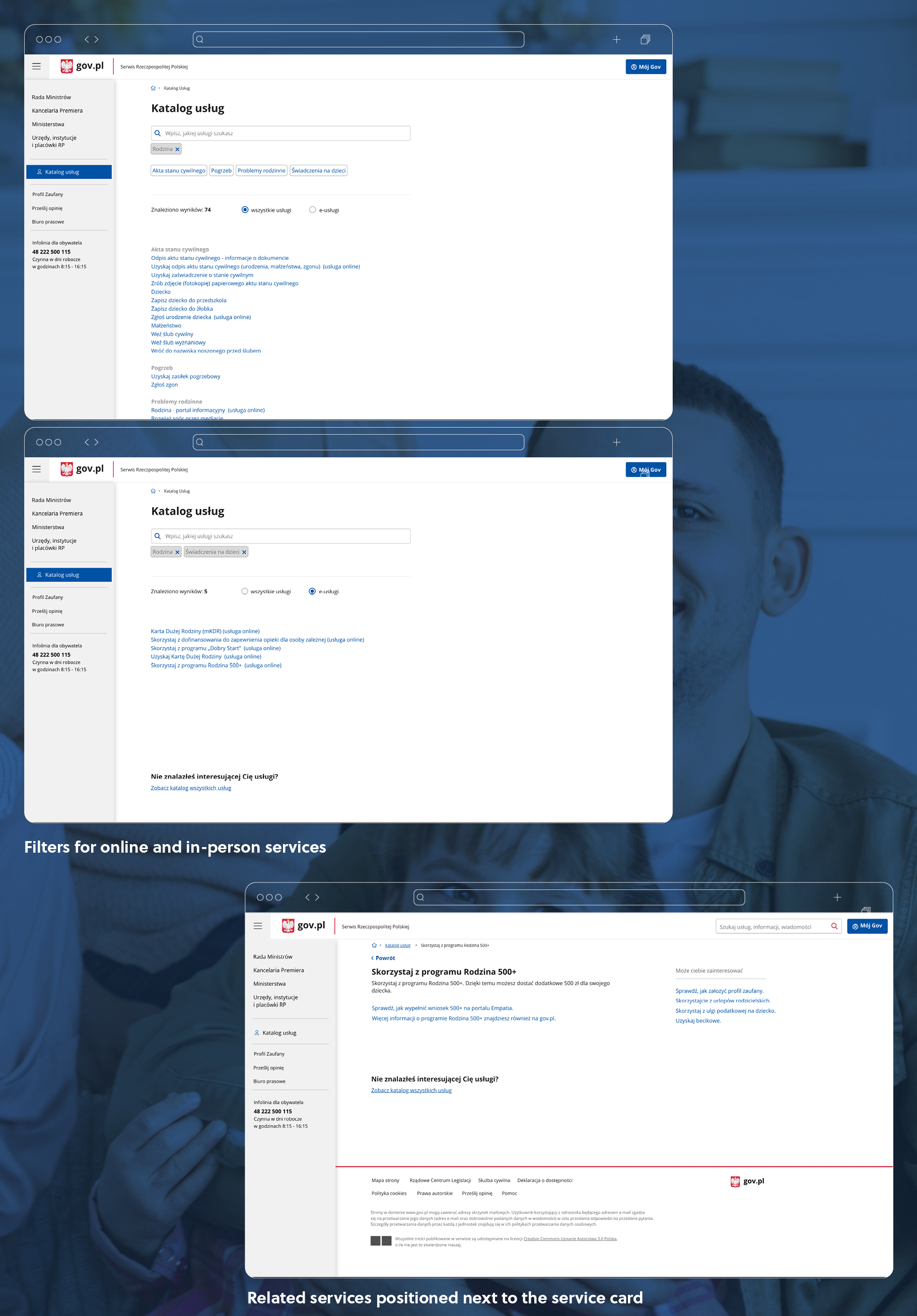
The inspiration for this solution came from online stores (in particular the Google Play), where faceted navigation is used to make it easier for the user to find their way among the multitude of products. First of all, I proposed that instead of the main navigation, the homepage should include all those services that are currently searched for the most (e.g Most Popular Services, Latest Services) positioned automatically based on internet traffic analysis. In addition, as a new way of navigation, I proposed filtering by chips to narrow down the selection. It is possible to enter the filter by clicking on the suggested chips or by typing own keywords. The additional option is the division into services that can be arranged online and those at which attendance is mandatory. Finally, other services related to the topic are positioned next to the service card.

Usability tests and conclusions:
At the very end, I conducted usability tests of the proposed solution using examples of the same few services as at the beginning. Users found their way around the new way of navigation and completed the test tasks faster than before, but rarer services where still difficult to find for them. Therefore I propose that the new version with chips filters could exist on par with the current hierarchical architecture model as well as the profound research on the way people are seeking the information at gov.pl should be conducted to come up with more effective solutions.